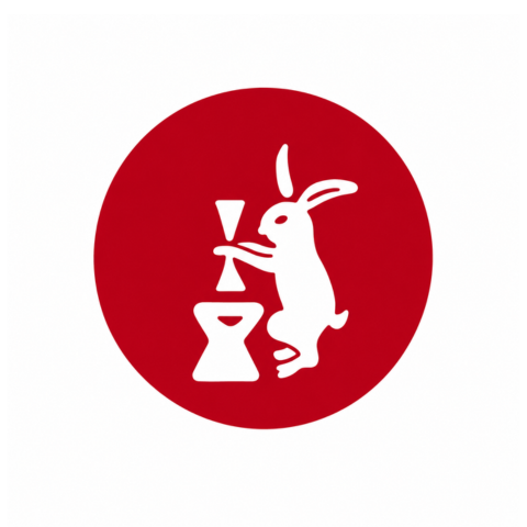
赤い円の中に、餅をつく白ウサギをかたどった、人呼んで「赤満月」は、旭製粉のロゴマークとして長年にわたり皆様に親しまれてきました。
このマークは、昭和27年3月、先代の会長・西田昴の父である西田定治郎が考案したものです。
当時、麦類製品の統制解除により小麦粉が自由販売商品となろうとしていました。この時を定治郎は、ただ小麦粉を販売するのではなく、旭製粉のブランドを築くチャンスと考えたのです。
それにふさわしい、当社オリジナル商品のネーミングを探していた彼は、出張先の旅館で見かけたマッチ箱の絵柄にヒントを得て、「赤い満月とウサギ」という独特の絵柄と、商品名「赤満月」を編み出しました。
以来、赤満月は旭製粉を代表するロゴマークとして60年以上にわたり皆様に愛され続けています。
なお、当社第一号商品となった「赤満月」は、今日も当社の主力商品として名を連ねるロングセラーです。
The "Aka-Mangetsu" (Red Full Moon) logo—featuring a white rabbit pounding mochi inside a red circle—has long been a familiar and beloved symbol of Asahi Seifun.
This logo was conceived in March 1952 by Sadajiro Nishida, the father of the company's former chairman, Subaru Nishida.
At the time, wheat flour was transitioning to open-market sales following the lifting of government controls on grain products. Sadajiro saw this as an opportunity not merely to sell flour, but to build a distinct brand for Asahi Seifun.
While searching for a fitting name for the company's original product, he found inspiration in the design on a matchbox at an inn he was visiting during a business trip; this led him to create the unique "Red Full Moon and Rabbit" motif and the product name "Aka-Mangetsu."
Since then, the "Aka-Mangetsu" logo has remained a cherished symbol of Asahi Seifun for over 60 years.
Furthermore, the "Aka-Mangetsu" product itself—the company's very first offering—remains a long-selling staple in our lineup to this day.